Deep Winter vs True Winter
- Jan 15
- 6 min read
Updated: Apr 17
So, you’re pretty sure you’re a Winter. You know cool, crisp tones suit you, warm or earthy colours drain you, and you generally shine in high-contrast or jewel-like shades. But you're not quite sure if you're a Deep Winter vs True Winter?
Both Deep Winter and True Winter belong to the Winter family. That means they are cool, bright, and dark. Neither season does well with warmth, softness, or muted tones. The key difference lies in the primary characteristic.
If we go back to the colour wheel, the distinction becomes clearer:
True Winter: cool, bright, medium to medium-deep
Deep Winter: deep, cool, bright
True Winter sits in the centre of the Winter season. It is fully cool, bright, and dark. Deep Winter, on the other hand, is pulled toward Autumn. It’s still cool, but significantly deeper and richer, with more intensity.
The True Winter palette feels crisp and clean, like a bright, frosty winter day with clear air.
The Deep Winter palette feels darker and more dramatic, like snow under a shadowed pine forest or twilight in winter.
So while both palettes are cool and sharp, True Winter is clearer and brighter, whereas Deep Winter is darker, richer, and more intense.
Deep Winter vs True Winter: Colour Qualities
Deep Winter colours are neutral-cool and dark. They are rich, bold, and intense, with higher contrast and a slightly more dramatic quality. The deeper shades create a striking, powerful effect that True Winter shades don’t quite reach.

True Winter colours are cool and clear. There’s a crispness to every shade, with blue or cool undertones keeping everything sharp and balanced. Even dark shades like charcoal or navy, remain clean and vibrant.

If lighter cool colours look too soft or washed out on you, and darker, richer shades feel more natural, that’s a clue you’re likely Deep Winter. If deep colours feel too heavy, True Winter is probably your home.
How to Determine If You’re a True Winter vs Deep Winter?
To tell these two apart, focus on coolness vs depth.
True Winter: cool first, depth second
Deep Winter: depth first, cool second
1. Find Your Primary Characteristic
Both seasons share coolness, but which trait dominates?
Cool vs Deep: Do your best colours feel crisp and icy (True Winter), or deep and intense (Deep Winter)?
Color Check: Do shades like icy blue, true red, black, and stark navy feel effortless (True Winter), or do you look better in deep charcoal, forest green, burgundy, or rich plum (Deep Winter)?
Contrast Check: Does your appearance handle high contrast between hair, skin, and eyes without being harsh (True Winter), or do richer, darker shades bring out your features more naturally (Deep Winter)?
If lighter cool shades feel too bright or stark on you, that’s a strong Deep Winter signal.
Makeup Check: Do you look better in purely cool-toned makeup (True Winter), or do you prefer darker, richer and slightly more neutral-cool makeup (Deep Winter)?


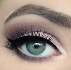
True Winter makeup


Deep Winter makeup
2. Eye and Hair Colour Patterns
These are patterns, not rules, but they help clarify things.
Deep Winter: Deep Winters typically have cool-toned, dark features—think black or dark brown hair with little to no warmth. Eyes may be dark brown, gray, or even cool hazel with a more intense, stark contrast to the skin. Deep Winters often display an overall cool, crisp quality in their features.
True Winter: True Winters may have dark brown, black, or medium brown hair, often with no visible warmth. Eye colour can range from deep brown to striking blue or green, often with high contrast against the whites of the eyes. The overall effect is cool, crisp, and intense.

3. The Colour Test
Compare fabrics from True Winter (left) and Deep Winter (right) palettes. Watch your reaction:
Icy Blue vs Deep Teal: Which makes your skin look alive?
True Red vs Deep Berry: Which brightens your eyes and complexion?
Emerald Green vs Deep Forest: Which feels right?
Magenta vs Mahogany: Which feels more natural and flattering?

Signs you’ve found your home season:
-people commenting on how refreshed or vibrant you look;
-needing less makeup to look polished;
-feeling more confident in your palette.
If deeper, richer shades consistently enhance your appearance more than medium-bright cool tones, you’re likely Deep Winter.
4. Comparing Sister Seasons
Finally, the method that might give you the most reliable answer - looking at the sister seasons. This should give you a pretty clear answer since one of them will usually be a complete no-go.
All palettes in the 12-season color analysis system have a sister season which shares the primary characteristic. You should be able to borrow some colors from your sister season and feel comfortable in that palette as well.
For Deep Winters, the sister season is Deep Autumn. For True Winters, it's True Summer.
Could you wear Deep Autumn-inspired colours like deep chocolate, dark olive, burgundy, and feel naturally at home? That points to Deep Winter.
Could you wear brighter, crisp True Summer shades like icy pink, soft lavender, or muted blues comfortably? That usually indicates True Winter.
One of the sister palettes will feel immediately “off.”
Comparing Deep Winter and True Winter Celebrities


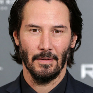


Deep Winter celebrities.


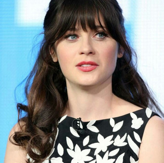


True Winter celebrities.
Notice how True Winter celebrities have a cooler undertone and a slight softness - bordering True Summer. Whereas Deep Winters have more depth and saturation - bordering on Deep Autumn. Both are cool seasons, but True Winter is more obviously cool, whereas Deep Winter is cool-neutral.
Read more about Winter celebrities here.
*It's important to note that most of these celebrities have not been truly color analysed and therefore, it's impossible to know their season with 100% certainty. However, their features and the way they look in certain colors are consistent with certain seasons. But as always, take celebrity analyses with a grain of salt.
For Deep Winters
The Deep Winter palette has a rich, cool intensity that creates a dramatic and crisp look. Key colors for Deep Winters include:
True Black: A true black that brings out the depth and intensity of this season.
Burgundy: A cool, deep red that feels luxurious and intense.
Midnight Blue: A rich, dark blue that is cool and sophisticated.
Emerald Green: A jewel-toned green.
Deep Royal Purple: A sophisticated and saturated jewel-toned purple
Cranberry Red: A cool, deep red with a hint of purple, perfect for adding a pop of color.
Check out the best and worst colors and color combinations for Deep Winters in this in-depth color palette guide.
Wardrobe Staples: Go for high-contrast colors like black, navy, cool reds, and dark purples. Think structured silhouettes and crisp fabrics to match the intensity of your palette.
Makeup: Cool-toned makeup works best—try deep berry lip colors, charcoal or navy eyeliner, and cool, icy highlighters. Avoid warm tones that can clash with your cool undertones.
Hair Color: Stick to cool-toned shades like raven black, dark ash brown, or cool-toned highlights. Warm or golden tones may feel out of place with the overall coolness of this palette.
Read more about Deep Winters.


For True Winters
The True Winter palette is filled with cool, intense colors that are crisp and high-contrast. These colors are bold and striking, perfect for those who can pull off dramatic, powerful looks. Key colors include:
Cobalt Blue: A bold, cool blue that’s vibrant and striking.
Cool Red: A deep, cool red with blue undertones, classic and powerful.
Icy Pink: A light, cool pink with a frosty, crisp quality.
Bright White: A clean, cool white that’s sharp and clear.
Jet Black: The ultimate deep, cool neutral that adds contrast and drama.
Check out the best and worst colors and color combinations for True Winters in this in-depth color palette guide.
Tips:
Wardrobe Staples: Choose bold, cool colors like cobalt blue, bright white, and cool red. Think sharp, structured fabrics that reflect the intensity and clarity of winter.
Makeup: Opt for cool, vibrant tones in your makeup—think bold red lips, icy highlighters, and cool-toned eyeshadows. Avoid anything too warm or muted.
Hair Color: Stick to cool-toned hair colors, such as jet black, deep espresso, or cool dark brown. Avoid adding warmth to your hair.
Read more about True Winters.


More ideas on Pinterest.


Comments